
Makeover Monday 28/10/2019 World Cities Ranked by Annual Sunshine Hours
Week 44 World Cities Ranked by Annual Sunshine Hours
Data from here
Load packages and import data
import pandas as pd
import altair as alt
df = pd.read_excel('https://query.data.world/s/k5e6ouinen6qpkowpudpowkepydrah')
df.head()
| Continent | Country | City | Jan | Feb | Mar | Apr | May | Jun | Jul | Aug | Sep | Oct | Nov | Dec | Year | |
|---|---|---|---|---|---|---|---|---|---|---|---|---|---|---|---|---|
| 0 | Africa | Ivory Coast | Gagnoa | 183.0 | 180.0 | 196.0 | 188.0 | 181.0 | 118.0 | 97.0 | 80.0 | 110.0 | 155.0 | 171.0 | 164.0 | 1823.0 |
| 1 | Africa | Ivory Coast | Bouaké | 242.0 | 224.0 | 219.0 | 194.0 | 208.0 | 145.0 | 104.0 | 82.0 | 115.0 | 170.0 | 191.0 | 198.0 | 2092.0 |
| 2 | Africa | Ivory Coast | Abidjan | 223.0 | 223.0 | 239.0 | 214.0 | 205.0 | 128.0 | 137.0 | 125.0 | 139.0 | 215.0 | 224.0 | 224.0 | 2296.0 |
| 3 | Africa | Ivory Coast | Odienné | 242.0 | 220.2 | 217.3 | 214.7 | 248.8 | 221.8 | 183.5 | 174.5 | 185.4 | 235.8 | 252.0 | 242.6 | 2638.6 |
| 4 | Africa | Ivory Coast | Ferké | 279.0 | 249.0 | 253.0 | 229.0 | 251.0 | 221.0 | 183.0 | 151.0 | 173.0 | 245.0 | 261.0 | 262.0 | 2757.0 |
So we have a line for each country/city and a column for each month. In ggplot, and probably Altair, it’s not ideal, so I’ll try to create a month column.
df_pivot = df.melt(['Continent', 'Country', 'City', 'Year'], var_name= 'Month', value_name = 'Sunshine')
df_pivot.head()
| Continent | Country | City | Year | Month | Sunshine | |
|---|---|---|---|---|---|---|
| 0 | Africa | Ivory Coast | Gagnoa | 1823.0 | Jan | 183.0 |
| 1 | Africa | Ivory Coast | Bouaké | 2092.0 | Jan | 242.0 |
| 2 | Africa | Ivory Coast | Abidjan | 2296.0 | Jan | 223.0 |
| 3 | Africa | Ivory Coast | Odienné | 2638.6 | Jan | 242.0 |
| 4 | Africa | Ivory Coast | Ferké | 2757.0 | Jan | 279.0 |
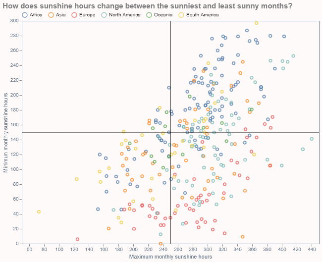
Now creating variables for minimum/maximum monthly sunshine.
#### data frame with max vs min sunshine time
df_plot=df.drop(columns='Year')
df_plot['max_sunshine']=df_plot.loc[:, 'Jan':'Dec'].max(1)
df_plot['min_sunshine']=df_plot.loc[:, 'Jan':'Dec'].min(1)
df_plot.head()
| Continent | Country | City | Jan | Feb | Mar | Apr | May | Jun | Jul | Aug | Sep | Oct | Nov | Dec | max_sunshine | min_sunshine | |
|---|---|---|---|---|---|---|---|---|---|---|---|---|---|---|---|---|---|
| 0 | Africa | Ivory Coast | Gagnoa | 183.0 | 180.0 | 196.0 | 188.0 | 181.0 | 118.0 | 97.0 | 80.0 | 110.0 | 155.0 | 171.0 | 164.0 | 196.0 | 80.0 |
| 1 | Africa | Ivory Coast | Bouaké | 242.0 | 224.0 | 219.0 | 194.0 | 208.0 | 145.0 | 104.0 | 82.0 | 115.0 | 170.0 | 191.0 | 198.0 | 242.0 | 82.0 |
| 2 | Africa | Ivory Coast | Abidjan | 223.0 | 223.0 | 239.0 | 214.0 | 205.0 | 128.0 | 137.0 | 125.0 | 139.0 | 215.0 | 224.0 | 224.0 | 239.0 | 125.0 |
| 3 | Africa | Ivory Coast | Odienné | 242.0 | 220.2 | 217.3 | 214.7 | 248.8 | 221.8 | 183.5 | 174.5 | 185.4 | 235.8 | 252.0 | 242.6 | 252.0 | 174.5 |
| 4 | Africa | Ivory Coast | Ferké | 279.0 | 249.0 | 253.0 | 229.0 | 251.0 | 221.0 | 183.0 | 151.0 | 173.0 | 245.0 | 261.0 | 262.0 | 279.0 | 151.0 |
selection = alt.selection_multi(fields=['Continent'])
color = alt.condition(selection,
                    alt.Color('Continent:N'),
                    alt.value('lightgray'))

base_chart = alt.Chart(df_plot).mark_point().encode(
    y=alt.Y('min_sunshine', title='Minimun monthly sunshine hours'),
    x=alt.X('max_sunshine',scale=alt.Scale(domain=[50, 450]),
            title='Maximum monthly sunshine hours'),
    color=color,
    tooltip=['Country','City']
).add_selection(
    selection
)

df_line = pd.DataFrame({'x': [250], 'y': [150]})
v_line = alt.Chart(df_line).mark_rule(color='black', strokeWidth=1).encode(x='x:Q')
h_line = alt.Chart(df_line).mark_rule(color='black', strokeWidth=1).encode(y='y:Q')

chart = (base_chart+v_line+h_line).configure(
    background='Snow'
).properties(
    title='How does sunshine hours change between the sunniest and least sunny months?',
    width=600,
    height=450
).configure_legend(
    orient='top',
    title=None,
    offset=5
).configure_axis(
    grid=False,
    domain=False,
    titleFontSize=11,
    titleFontWeight='normal',
    titleColor='slategray',
    labelColor='slategray'
).configure_view(
    strokeWidth=1,
    stroke='slategrey'
).configure_title(
    fontSize=15,
    anchor='start',
    color='gray'
)

chart.save("../docs/assets/images/2019_10_28_MM.png")
chart.save('2019_10_28_MM.html')
Static view of the plot as a png:
Interactive view: