Tidy Tuesday 20/08/2019 Nuclear Explosions
Data description
From From TidyTuesdays github:
This week’s data is from Stockholm International Peace Research Institute, by way of data is plural with credit to Jesus Castagnetto for sharing the dataset.
Additional information can be found on Wikipedia or via the original report PDF.
Additional related datasets can be found at Our World in Data.
For details around units for yield/magnitude, please see the Nuclear Yield formulas.
Import data and packages
library(tidyverse)
library(ggradar)
library(scales)

# nuclear_explosions <- readr::read_csv("https://raw.githubusercontent.com/rfordatascience/tidytuesday/master/data/2019/2019-08-20/nuclear_explosions.csv")
#write_csv(nuclear_explosions, "nuclear_explosions.csv")

nuclear_explosions <- readr::read_csv("nuclear_explosions.csv")
Data
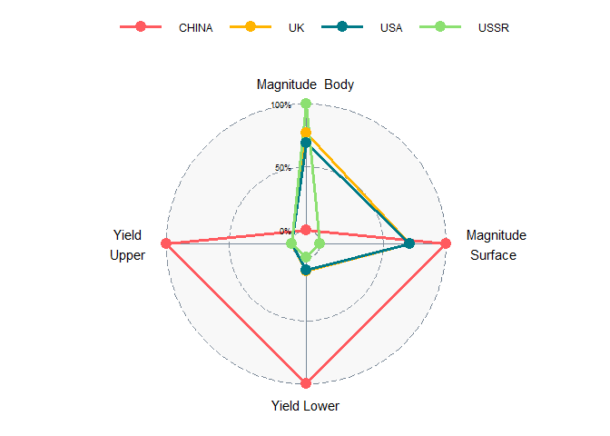
I’m inclined to do a radar chart, a jojo chart, to show the power of the explosions.
unique(nuclear_explosions$country)
## [1] "USA" "USSR" "UK" "FRANCE" "CHINA" "INDIA" "PAKIST"
Let’s make the chart for the USA for the biggest average yield in each year.
nuclear_explosions %>%
  select(country, year, magnitude_body, magnitude_surface,
         yield_lower, yield_upper) %>%
  group_by(country, year) %>%
  filter_all(all_vars(. > 0)) %>%
  slice(which.max(yield_upper)) %>%
  ungroup() %>%
  mutate(count_year = table(year)[as.character(year)]) %>%
  rename(group = country) %>%
  filter(count_year == max(count_year)) %>%
  select(-c(year, count_year)) %>%
  mutate_at(vars(-group), rescale) %>%
  ggradar(
    base.size = 8,
    axis.labels = c('Magnitude  Body',
                    'Magnitude \n Surface',
                  'Yield Lower',
                  'Yield \n Upper'),
    gridline.min.colour = 'slategrey',
    gridline.mid.colour = 'slategrey',
    gridline.max.colour = 'slategrey',
    grid.label.size = 3,
    axis.label.size = 4,
    axis.line.colour = 'lightslategrey',
    group.line.width = 1.2,
    group.point.size = 4,
    background.circle.colour = 'gainsboro',
    legend.text.size = 9,
    legend.position = 'top'
  )