
Storytelling with data 10/2019 Improve this table
My first Storytelling with data challenge. From October 2019.
Data description
From From Storytelling with data:

Import packages
library(tidyverse)
library(scales)
library(Cairo)
theme_set(theme_classic())
Data
Ex_1 <- tribble(
~Tier,	~Number_Account,	~Percentage_Accounts, ~Revenue_M, ~Percentage_Revenue,
'A',	77, 	7.08,	4.68,	25,
  'A+',	19, 	1.75,	3.93,	21,
  'B',	338, 	31.07,	5.98,	32,
  'C',	425, 	39.06,	2.81,	15,
  'D',	24, 	2.21,	0.37,	2
) %>%
  mutate(
    class = ifelse((Percentage_Accounts - Percentage_Revenue) < 0, 'blue', 'slategrey')
    )
Plot
I decided to make a modified slope graph to show the differences between the two tipes of shares. Looking back it would probably be better with two stacked, and connected, bar graphs but it was worth a shot.
First some accessory variables.
left_label <- Ex_1$Tier
positions_y <- Ex_1$Percentage_Accounts
positions_y[c(2,5)] <- positions_y[c(2,5)] + c(-.5,.5)
Then the plot.
ggplot(Ex_1) +
  geom_segment(aes(x=1, xend=2, y=Percentage_Accounts, yend=Percentage_Revenue, col=class),
               size=.75, show.legend=F) +
  geom_vline(xintercept=1, linetype="dashed", size=.1, color = 'lightslategrey') +
  geom_vline(xintercept=2, linetype="dashed", size=.1, color = 'lightslategrey') +
  scale_color_manual(labels = c("Up", "Down"),
                     values = c("slategrey"="slategrey", "blue"="blue")) +  # color of lines
  labs(x="", y="",
       title = 'New Client tier share changes when looking at Accounts or Revenue') +  # Axis labels
  scale_x_continuous(limits = c(.5, 2.5), breaks = NULL) +
  scale_y_continuous(
    limits = c(0,(1.1*(max(Ex_1$Percentage_Accounts, Ex_1$Percentage_Revenue)))),
    labels = percent_format(scale = 1)
    ) +
  geom_text(
    label=left_label, y=positions_y,
    x=c(.99,1.005,.99,.99,.99), hjust=1.2, size=3
    ) +
  geom_text(
    label=left_label, y=Ex_1$Percentage_Revenue,
    x=c(2.01,2.01,2.01,2.01,2.01), hjust=-.2, size=3
  ) +
  geom_text(
    label="Participation\nin Accounts", x=.68, y = 1.1*(max(Ex_1$Percentage_Accounts, Ex_1$Percentage_Revenue)),
    hjust=0, size=4.3, color = 'darkslategrey') +
  geom_text(
    label="Participation\nin Revenue", x=2.02, y = 1.1*(max(Ex_1$Percentage_Accounts, Ex_1$Percentage_Revenue)),
    hjust=0, size=4.3, color = 'darkslategrey') +
  geom_text(
    label = "C tier has low participation in \nrevenues despite the biggest \nshare of new accounts.",
    x = 2.1, y = 30, hjust = 0, size = 3.5, color = 'slategrey'
  ) +
  geom_text(
    label = "Together A and A+ make up for \nalmost half of the revenue \ndespite low share of \naccounts.",
    x = 2.1, y = 20, hjust = 0, size = 3.5, color = 'blue'
  ) +
  theme(panel.background = element_blank(),
        panel.grid = element_blank(),
        axis.ticks.y = element_line(color = 'lightslategrey'),
        axis.text.x = element_blank(),
        axis.line.x = element_blank(),
        axis.line.y = element_line(color = 'lightslategrey'),
        axis.text.y = element_text(color = 'lightslategrey'),
        panel.border = element_blank(),
        title = element_text(colour = "darkslategrey", face = 'bold'))
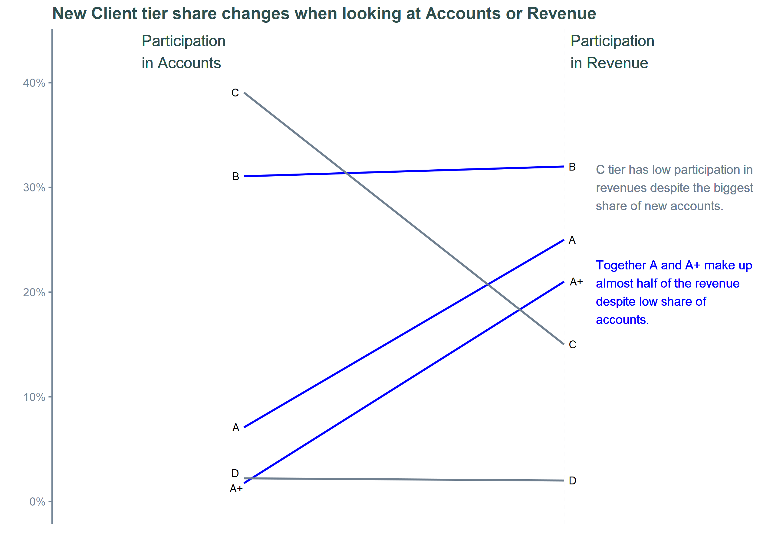
Saved with Cairo package because windows render is not so good.
path <- paste0(here::here("docs", "assets", "images"),"/", '2019_10_SWD.png')
ggsave(path, type = 'cairo', scale = 1.5)